
The Custom Forms module lets you build your own forms, such as intake forms, inspection checklists or service reports, and collect responses from them. You can build a form by dragging fields onto a canvas, generate one with AI from a description, or import an existing Google Form or file. Forms can be shared through a public link or attached to jobs for technicians to fill in.
Forms List
Go to Forms in the left menu to see all forms created in your account.
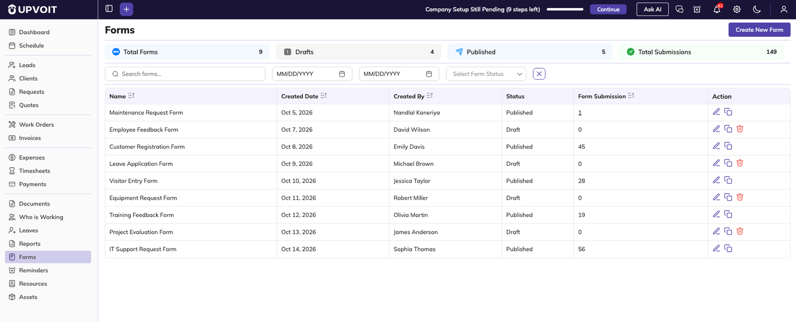
Summary Cards
-
Total Forms: Number of forms created.
-
Drafts: Forms that are saved but have no submissions yet.
-
Published: Forms that have received at least one submission.
-
Total Submissions: Total responses received across all forms.
Filters
-
Search forms: Search by form name.
-
Date range: Pick a start and end date to filter forms by created date.
-
Select Form Status: Show only Draft or Published forms.
-
Clear (X): Reset all filters.
List Columns
-
Name, Created Date, Created By: Basic form details. Click the sort icon next to a column header to sort.
-
Status: Draft or Published.
-
Form Submission: Number of responses received. Click the number to view the submissions (see Section 11).
Form Status
-
Draft: The form is saved but has no submissions yet.
-
Published: The form changes to Published automatically once it receives its first submission.
Actions
-
Edit (pencil): Open the form in the builder.
-
Clone: Create a copy of the form. The copy is named with “(Copy)” at the end.
-
Delete: Remove the form. Available only for Draft forms. Published forms cannot be deleted.
Create New Form
Click Create New Form on the Forms list page to open the form builder.

-
Name: Enter the form name. This is how the form appears in the Forms list.
-
Save: Saves the form with Draft status.
The builder has three areas:
-
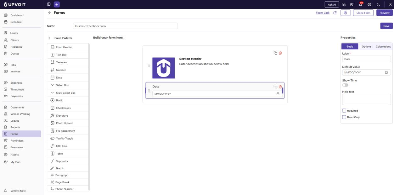
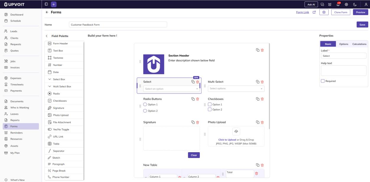
Field Palette (left): All available field types. Drag a field onto the canvas to add it. Click the arrow next to the title to collapse the palette.
-
Form Canvas (center): Your form as it is being built. Every new form starts with a Section Header showing your company logo. Use the drag handle (⋮⋮) to reorder fields, the copy icon to duplicate a field, and the delete icon to remove it.
-
Properties (right): Settings for the field currently selected on the canvas (see Section 5).
Available Fields
-
Form Header: Title block for the form, with an optional logo.
-
Text Box / Textarea: Short and long text answers.
-
Number, Date, URL Link: Inputs for specific types of values.
-
Select Box / Multi Select Box: Dropdowns allowing one or several choices.
-
Radio / Checkboxes: Choose one option or several options from a visible list.
-
Yes/No Toggle: Simple yes or no answer.
-
Signature: Signature pad with a Clear button.
-
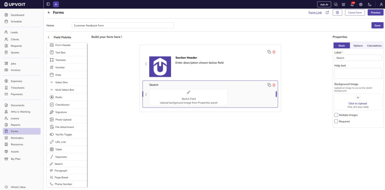
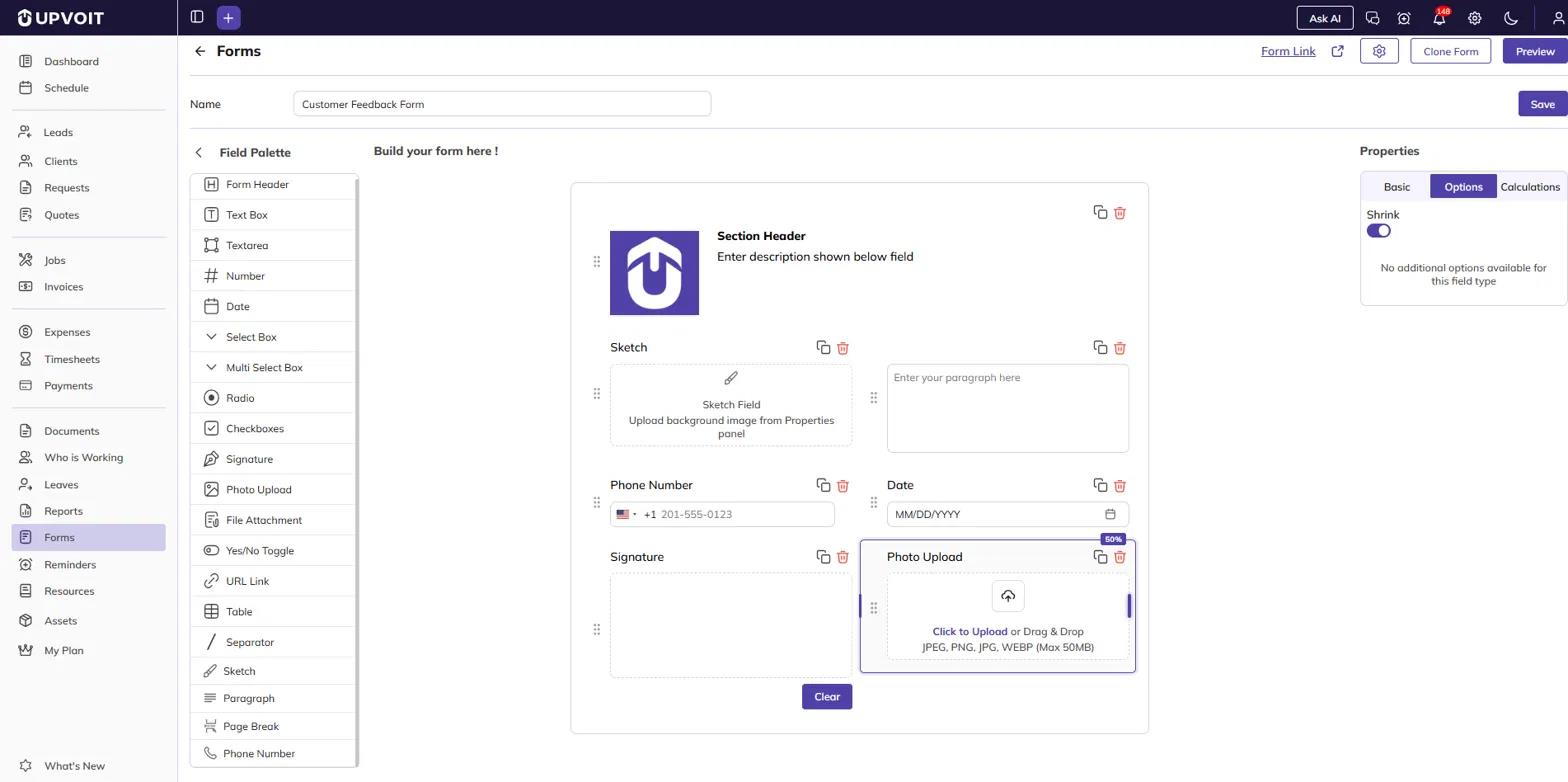
Sketch: Free-hand drawing area. You can upload a background image from the Properties panel.
-
Photo Upload: Lets users attach images (JPEG, PNG, JPG, WEBP, max 50 MB).
-
File Attachment: Lets users attach files (PDF, DOC, PPTX, XLSX, max 50 MB).
-
Table: Grid for entering rows of data. Columns and rows can be added or removed.
-
Paragraph: Display-only text, such as instructions.
-
Separator: Divider line between sections.
-
Page Break: Splits the form into multiple pages.
-
Phone Number: Phone input with a country code selector.
Edit Saved Form
Click Edit on a form in the list to reopen it in the builder. For saved forms, the AI Generate and Import buttons are replaced with the following options:

-
Form Link: Opens the form’s public link in a new tab. Anyone with this link can open and fill in the form, so you can share it with clients or others outside Upvoit.
-
Settings (gear icon): Opens General Settings.
-
Clone Form: Creates a copy of this form.
-
Preview: Shows the form as users will see it.
-
Save: Saves your changes.
Until you select a field on the canvas, the Properties panel shows “Select a field to edit properties.”
You can edit a Published form at any time. Changes apply only to new submissions. Existing submissions are not affected.
Preview Form
Click Preview in the builder to open the View Form page.

-
Submitted By: Added automatically to every form. It is filled with the name of the logged-in user and cannot be edited.
-
Reset: Clears all entered values.
-
Cancel: Closes the form without submitting.
-
Submit: Submits the form response. The form then resets so you can fill in a new entry.
-
Back to Forms: Returns to the Forms list.
-
Edit: Opens the form in the builder.
Field Properties
Select any field on the canvas to edit it in the Properties panel.
Basic
The Basic tab shows different settings depending on the field type. Label is mandatory for all input fields that have one.
Common Settings
-
Label: Field name shown on the form.
-
Placeholder: Hint text shown inside the empty field.
-
Default Value: Value already filled in when the form opens. Users can change it unless the field is Read Only.
-
Help text: Guidance shown below the field.
-
Required: The field must be filled in before the form can be submitted.
-
Read Only: Users can see the field but cannot change its value.
Settings by Field Type
-
Text input fields (Text Box, Textarea, Number, URL Link):

-
Paragraph:

-
Date:
-
Show Time: Lets users pick a time along with the date.
-
-
Yes/No Toggle:

-
These fields have just these three settings:
-
Select Box
-
Multi Select Box
-
Radio
-
Checkboxes
-
Signature
-
Photo Upload
-
File Attachment
-
Table
-
Phone Number
-
-
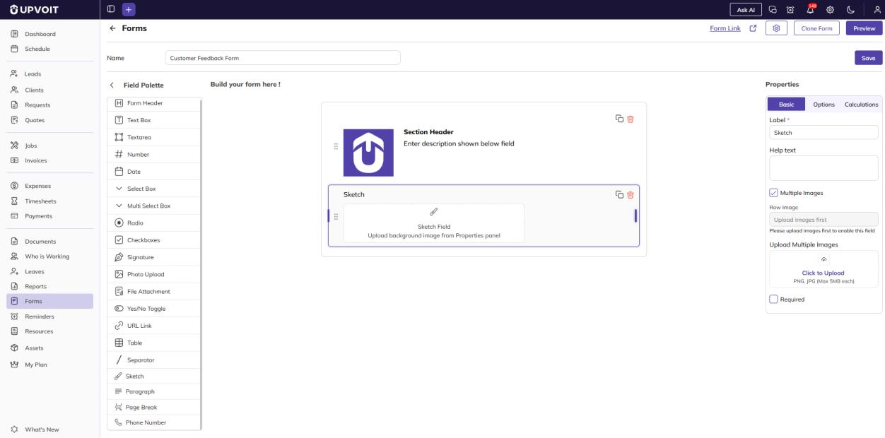
Sketch:
-
Background Image: Upload an image for users to draw on, such as a floor plan or equipment diagram (PNG or JPG, max 5 MB).
-
Multiple Images: Allows more than one background image.
-
-
Form Header / Section Header:

-
Layout fields (Separator, Page Break): No settings. The Properties panel shows “Select a field to edit properties.”

Options
The Options tab shows different settings depending on the field type.
Shrink (all fields)
-
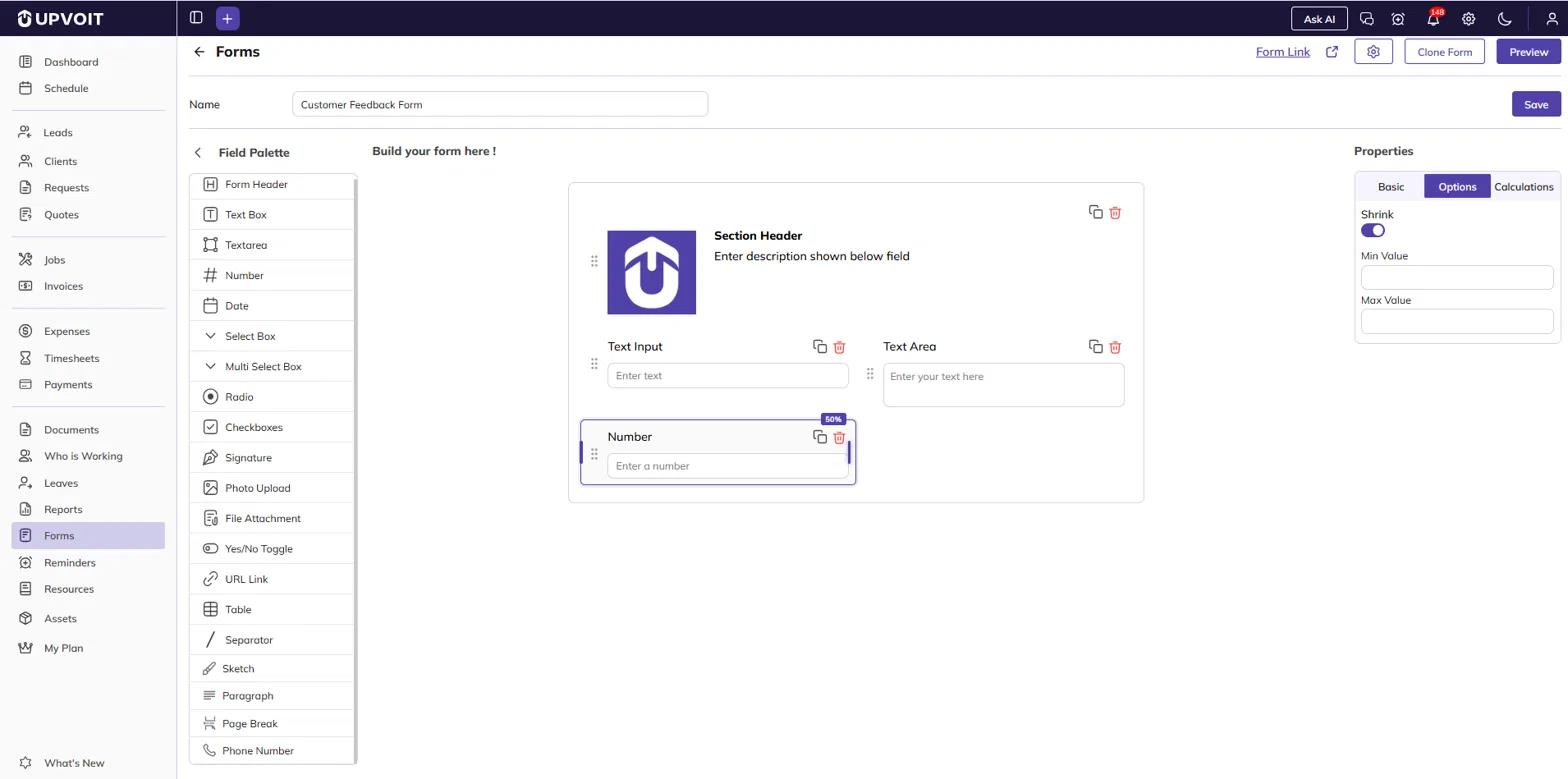
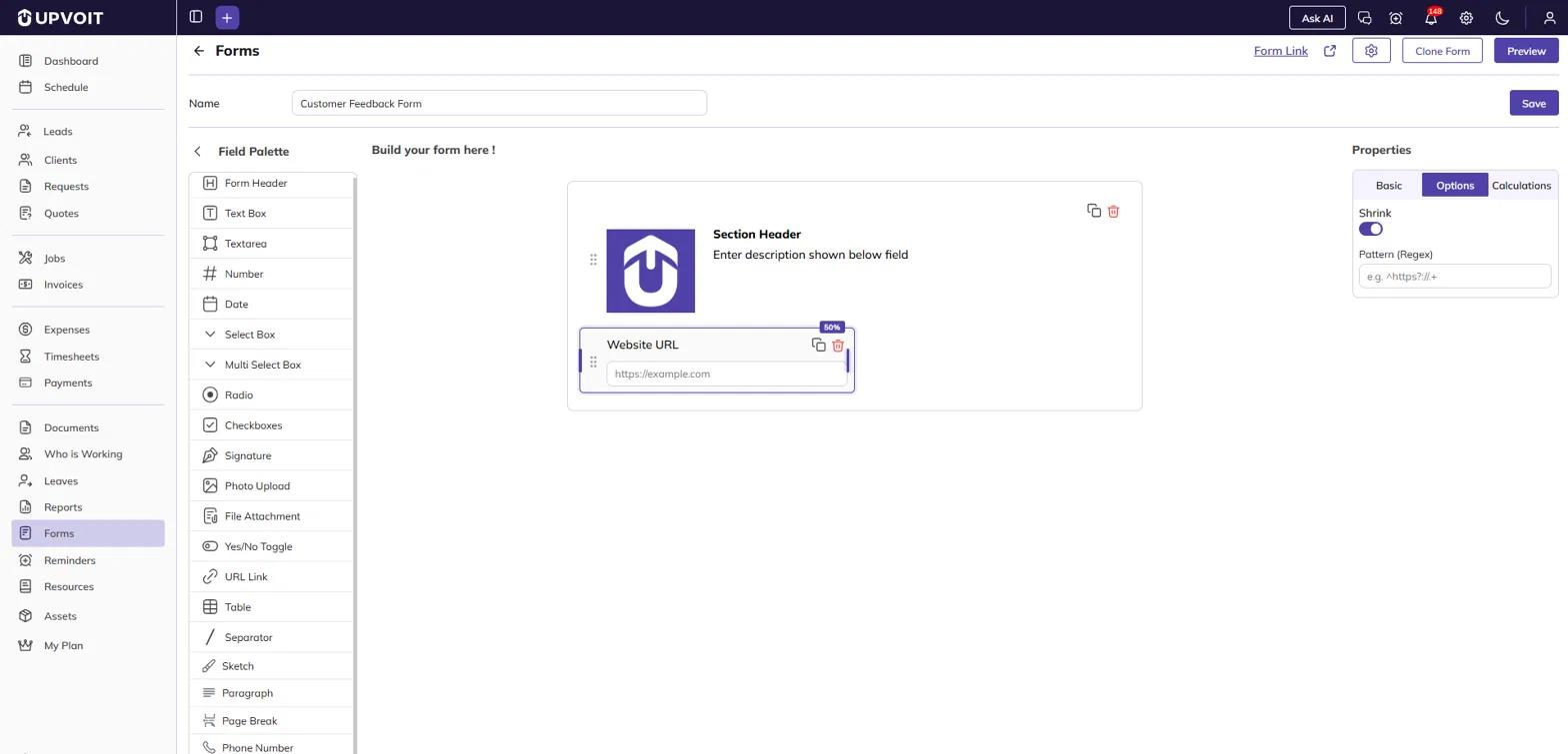
Shrink: Reduces the field to half the form width (marked with a “50%” badge), so you can place two fields side by side. When Shrink is off, the field spans the full width.
Settings by Field Type
-
Text Box and Textarea: Shrink, plus Validation:

-
Number: Shrink, plus:
-
URL Link: Shrink, plus:
-
Select Box, Multi Select Box, Radio and Checkboxes: Shrink, plus Options:

-
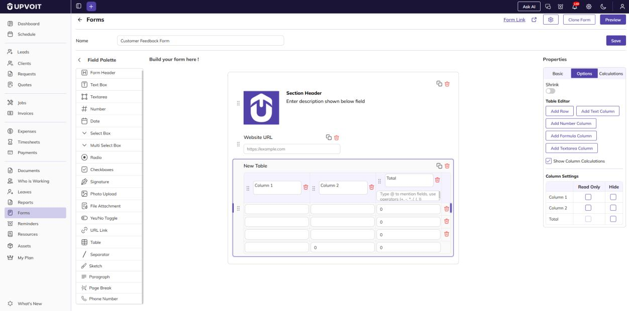
Table: Shrink, plus:
-
Table Editor: Use Add Row to add a row. To add a column, use Add Text Column, Add Number Column, Add Formula Column (calculated from other columns, see Table Formula) or Add Textarea Column.
-
Show Column Calculations: Shows a totals row at the bottom of the table.
-
Column Settings: For each column, select Read Only to stop users from editing it, or Hide to hide it from the form.
-
-
Shrink only: These fields have no other options, and the tab shows “No additional options available for this field type”:
-
Form Header / Section Header
-
Date
-
Yes/No Toggle
-
Signature
-
Photo Upload
-
File Attachment
-
Sketch
-
Paragraph
-
Phone Number
-
-
Separator and Page Break: No options.
Calculations
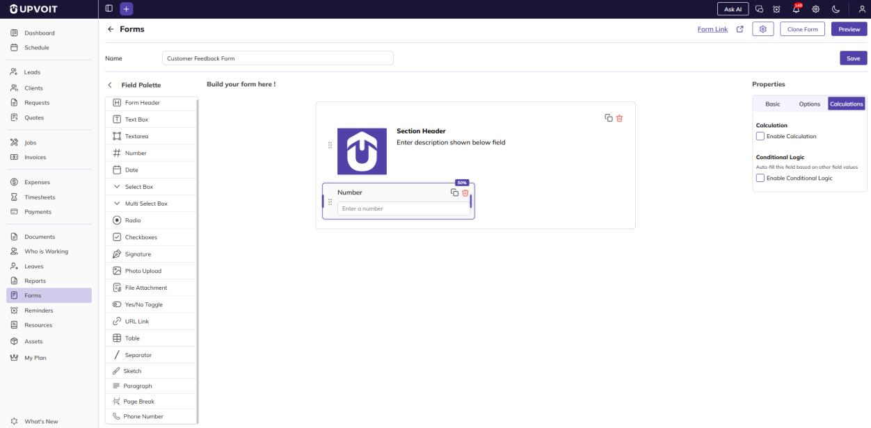
The Calculations tab is available once the form has been saved.
Settings by Field Type
-
Conditional Logic only: Text Box, Textarea, Select Box, Radio, Yes/No Toggle, Paragraph.

-
Calculation and Conditional Logic: Number.
-
Table Formula and Conditional Logic: Table.

-
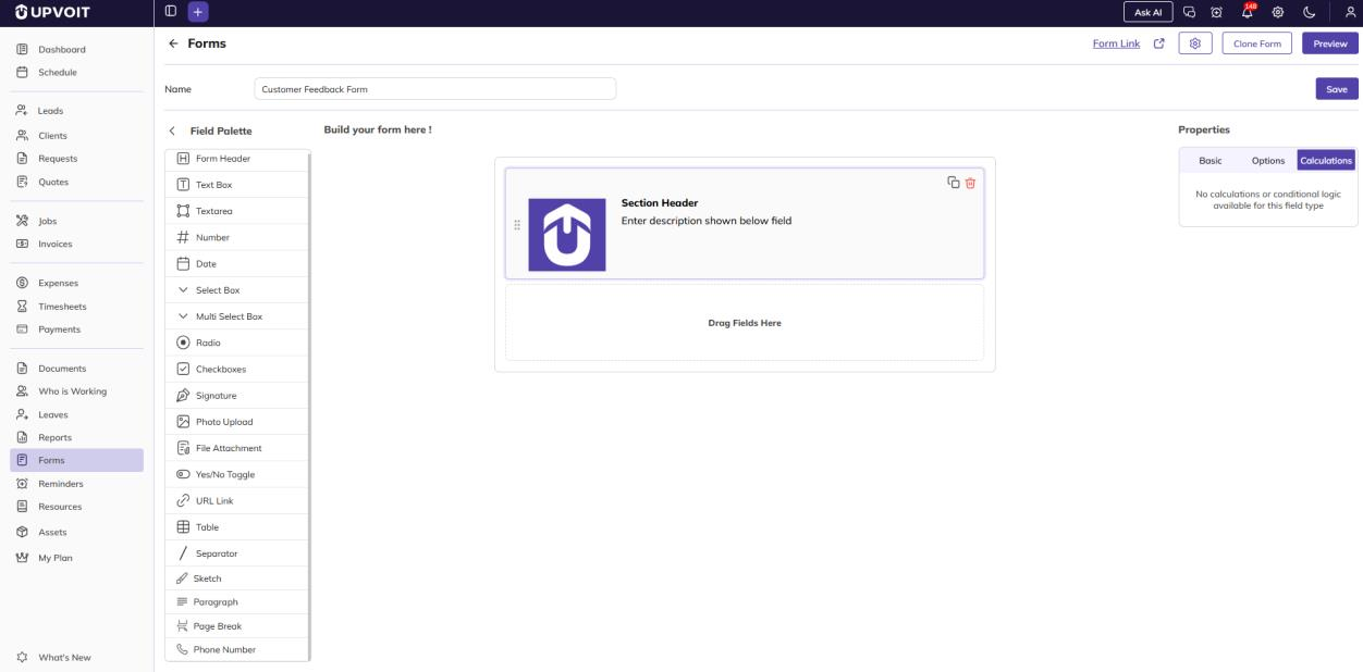
No calculations: Form Header / Section Header, Date, Multi Select Box, Checkboxes, Signature, Photo Upload, File Attachment, URL Link, Sketch and Phone Number. The tab shows “No calculations or conditional logic available for this field type.”
Calculation (Number field)
Use this option to calculate a Number field’s value automatically from other fields, for example, Total = Hours × Rate.

-
Select Enable Calculation. The Formula Builder appears.
-
Type @ to choose a field, and use the operators + − × ÷ and brackets to build the formula.
-
Click Clear to remove the formula and start again.
Table Formula (Table field)
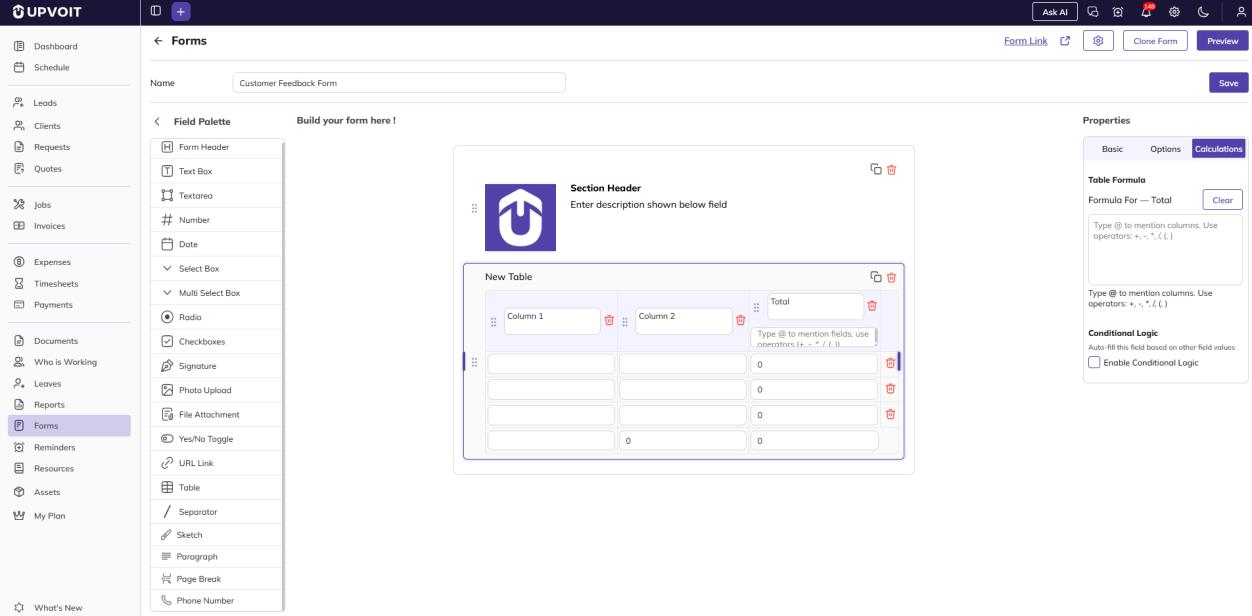
Use this option to calculate a formula column from other columns in the same row, for example, Total = Column 1 × Column 2.
-
Select the Table field and open the Calculations tab.
-
Under Table Formula, enter the formula for the column (for example, Formula For – Total). Type @ to choose columns, and use the operators + − × ÷ and brackets. You can also type the formula directly under the column name on the canvas.
-
Click Clear to remove the formula.
Conditional Logic
Use this option to change a field based on the values entered in other fields.
-
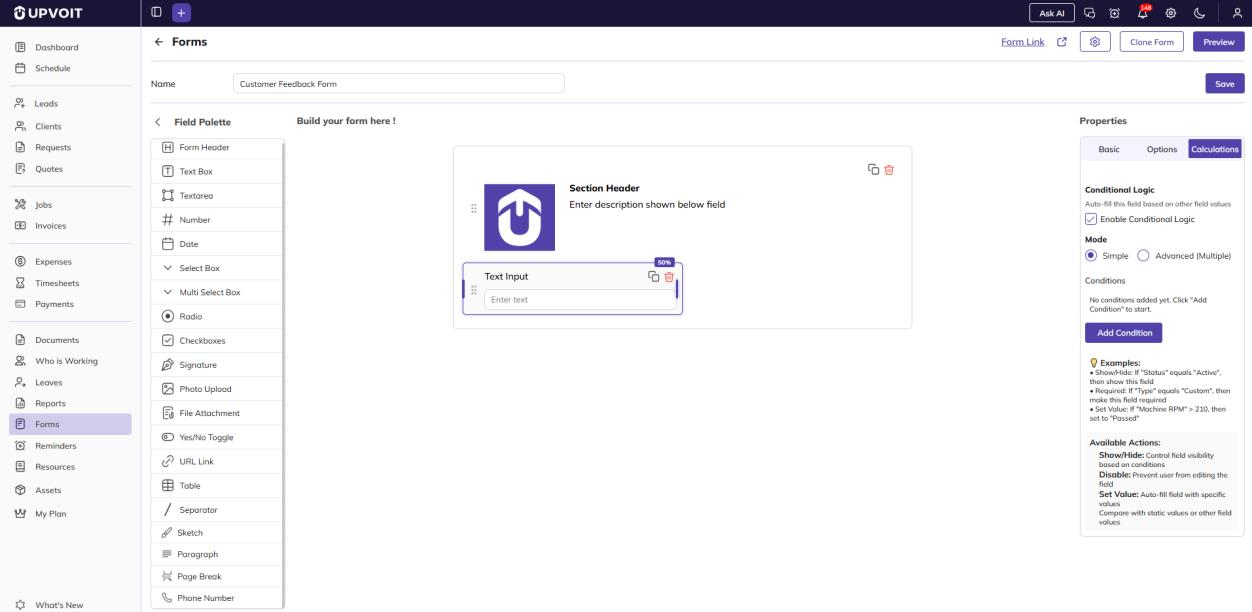
Select Enable Conditional Logic. The Mode and Conditions settings appear.
-
Choose a Mode:
-
Simple: One condition.
-
Advanced (Multiple): Several conditions. An Add Condition button stays below the conditions so you can add more. The action applies only when all conditions are met.
-
-
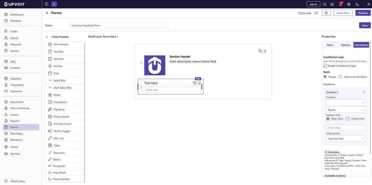
Click Add Condition and fill in the details.
-
Click X on a condition to remove it.
Condition Fields
-
IF (When): The field to check. Only Number, Radio, Yes/No Toggle and Text Box fields on the form can be selected.
-
Operator: How to compare the value. The options are Equals, Not Equals, Greater Than, Less Than, Greater or Equal, Less or Equal, and Contains.

-
Compare with:
-
Static Value: Type a fixed value.
-
Another Field: Compare against another Number, Radio, Yes/No Toggle or Text Box field on the form.
-
-
THEN (Action): What happens to this field when the condition is met:
-
Show this field / Hide this field: Control whether the field is visible.
-
Make this field required: The field must be filled in before the form can be submitted.
-
Disable this field: Prevents the user from editing the field.
-
Set value: Fills the field automatically with a specific value.
-

Example: If “Machine RPM” is greater than 210, set this field to “Passed”.
Note: To make a field always mandatory, select Required in the Basic tab. To make it mandatory only in certain situations, use Conditional Logic with the action Make this field required.
General Settings
Click the gear icon at the top of the builder to change the overall look and access of the form.

Appearance
-
Page Color / Form Color / Text Color: Background of the page, background of the form, and text color.
Layout
-
Label Alignment: Place field labels above (Top), to the right (Right) or to the left (Left) of the input.
-
Question Spacing: Space between fields, in pixels.
-
Form Width: Width of the form.
Font Family
-
Font Family / Font Size: Font and text size used in the form.
Access & Security
-
Expiry Date: Date after which the form stops accepting responses.
Click Save to apply the settings.
AI Generate
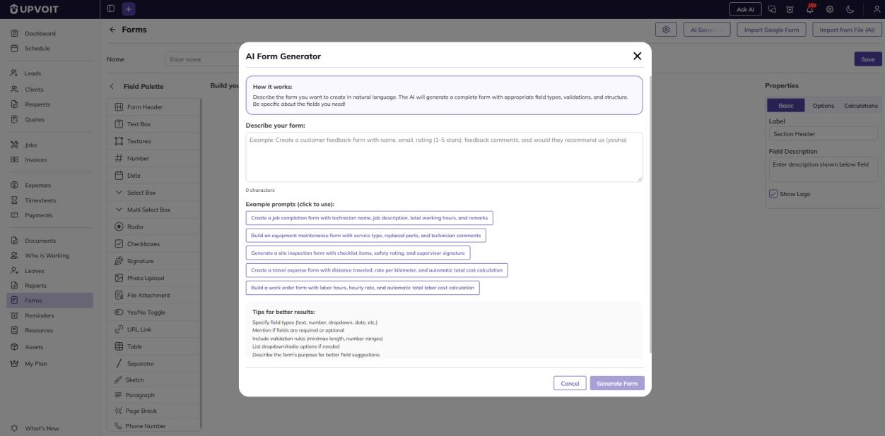
Click AI Generate to create a form from a plain-language description. This option is available only while creating a new form.
-
Describe the form you need in the Describe your form box, or click one of the Example prompts to use it.
-
Click Generate Form. The AI adds the fields to the canvas.
-
Review the fields and adjust them as needed, then save.
For better results, mention the field types, which fields are required, any validation rules (for example min/max values), and the options for dropdowns or radio buttons.
Import Google Form
Click Import Google Form to recreate an existing Google Form in Upvoit. This option is available only while creating a new form.
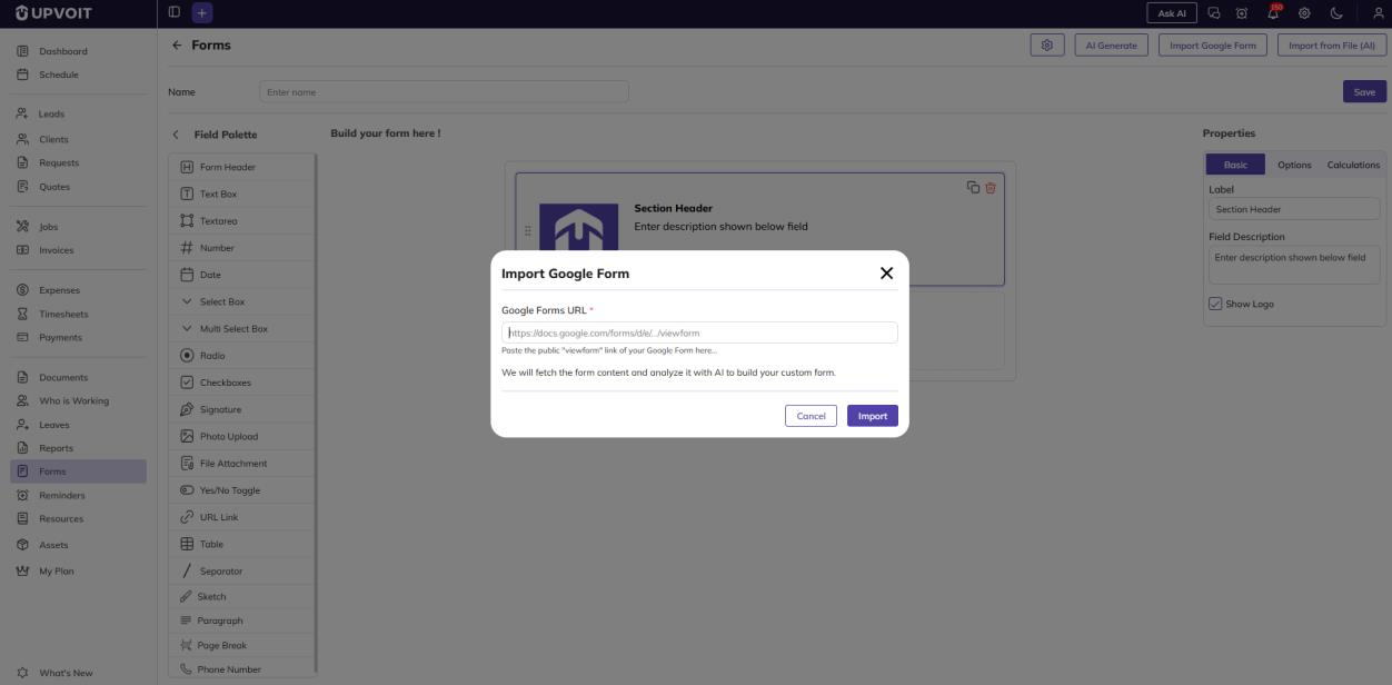
-
Paste the public viewform link of your Google Form.
-
Click Import. Upvoit reads the form and uses AI to build matching fields.
-
Review the imported fields and save.
Import from File (AI)
Click Import from File (AI) to build a form from an existing document, such as a paper form or a scanned image. This option is available only while creating a new form.
-
Select the file from your computer and click Open.
-
The AI reads the file and adds matching fields to the canvas.
-
Review the fields and save.
Using Custom Forms in Jobs
You can attach a custom form to a job so the assigned technician fills it in as part of the work, for example as a service report or an inspection checklist.
Enable Custom Forms for Jobs
The Custom Form dropdown appears on the job page only when this setting is enabled.

Attach Form to Job

-
Custom Form: On the Create Job page, select a form from the Custom Form dropdown. Once the job is assigned, the form becomes visible to that technician.
Fill in the Form (Web)
The technician opens the job in their account. The attached form appears under the Custom Form Link section.
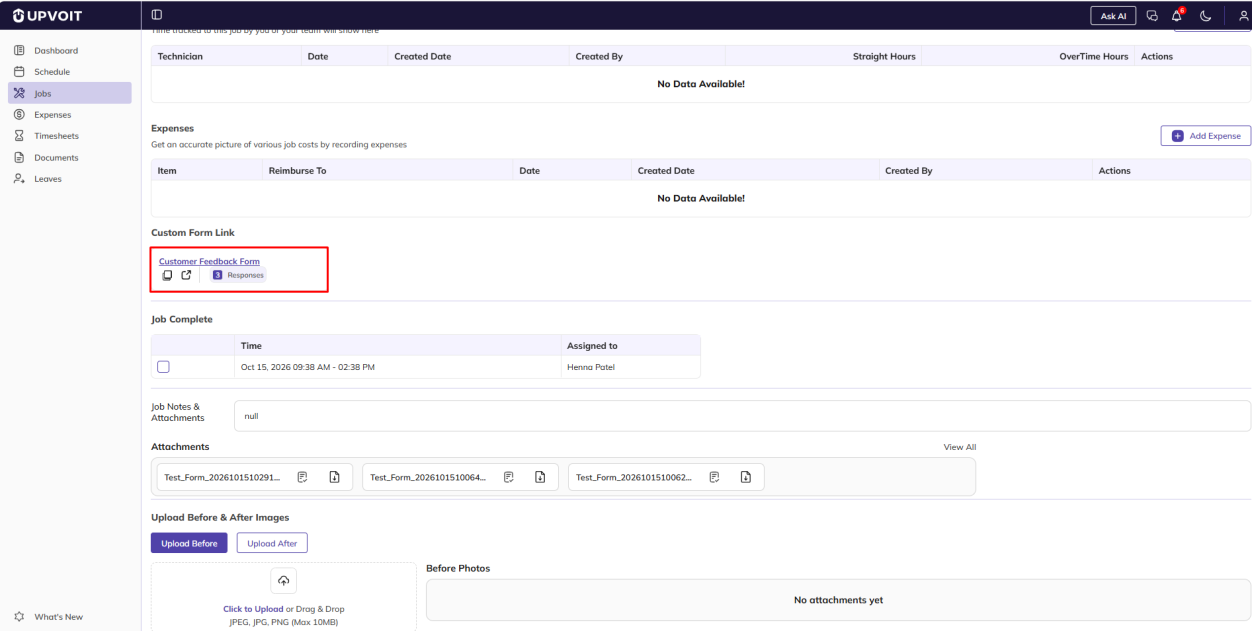
-
Form name: Click to open and fill in the form.
-
Copy: Copies the form link.
-
Open (↗): Opens the form in a new tab.
Fill in the Form (Mobile App)
-
Open the job and tap the form name.
-
Fill in the fields. Submitted By is filled automatically with the technician’s name and cannot be changed.
-
Tap Submit. A “Form saved successfully” message appears. Tap Ok to close it.
A technician can submit the same form more than once for a job. Each submission is saved separately and adds to the form’s Form Submission count.
View Form Submissions
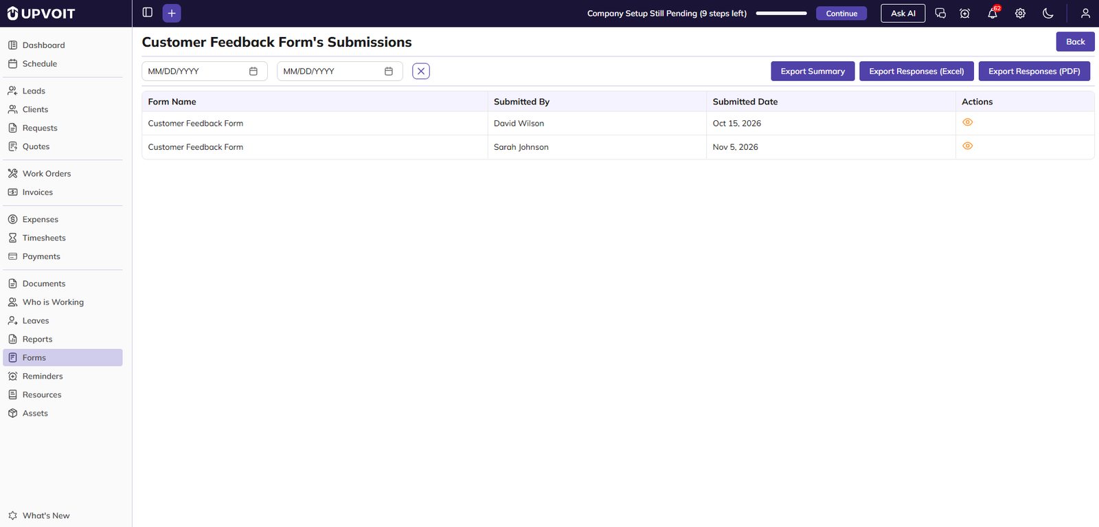
To see the responses for a form, click the number in the Form Submission column on the Forms list. This opens the Submissions page for that form.
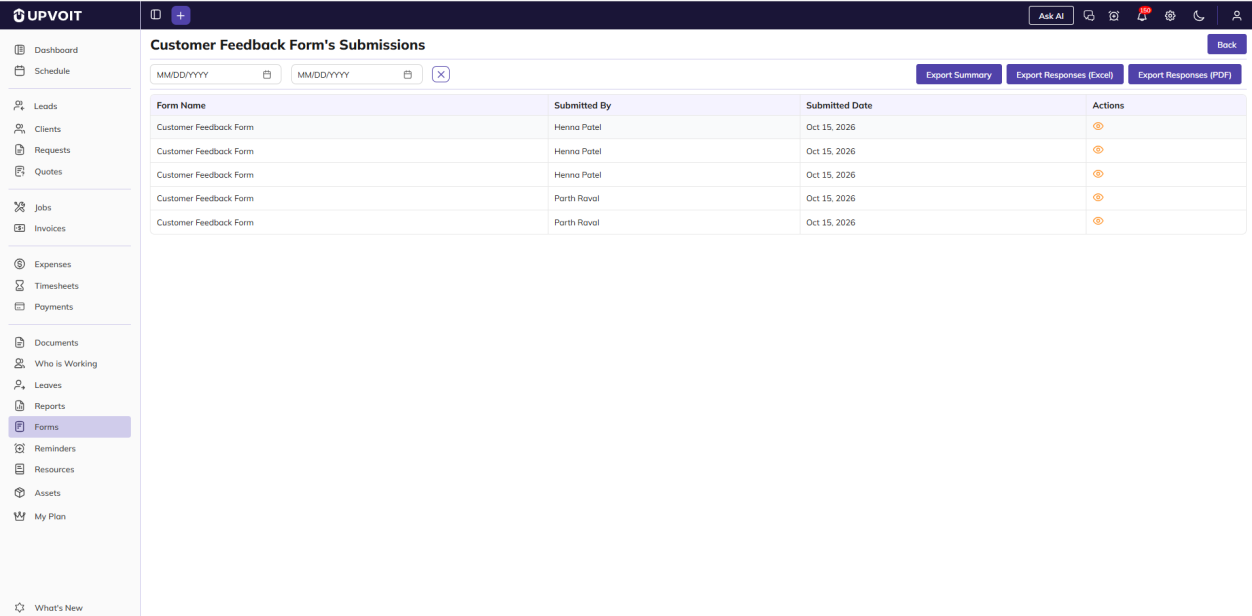
Filters
-
Date range: Pick a start and end date to filter submissions by submitted date.
-
Clear (X): Reset the filter.
Export Options
-
Export Summary: Downloads an Excel file listing each submission with the form name, submitter and submitted date. Field values are not included.
-
Export Responses (Excel): Downloads all responses, including the values entered in each field, as an Excel file.
-
Export Responses (PDF): Downloads all responses as a PDF.
List Columns
-
Form Name, Submitted By, Submitted Date: Details of each submission.
-
View (eye icon): Opens the full response.
Submission Details
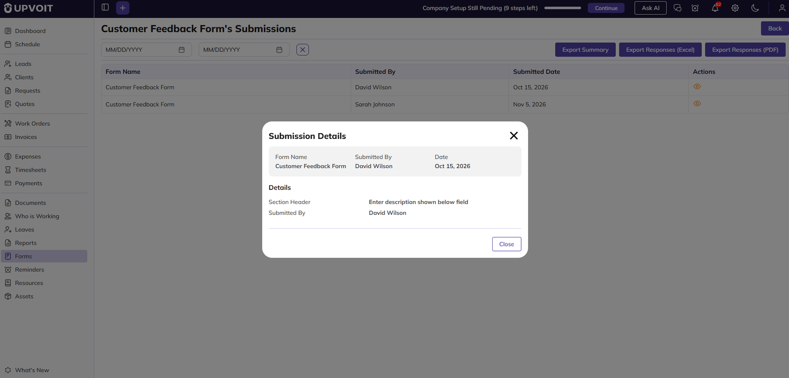
Clicking the eye icon opens a pop-up showing the form name, who submitted it, the date, and every field with the value entered. Click Close to return.
Click Back to return to the Forms list.
Did this answer your question?


